Schoolhouse Fall/Winter Campaign 2025
As Senior Designer at Schoolhouse, I led the development of the visual identity for the Fall/Winter 2025 campaign, Future Comforts. This work included the creation of a bespoke campaign logo, a custom typography system, and a defined color palette, as well as the design and rollout of unique email templates to ensure cohesive execution across all customer touchpoints.
schoolhosue.com
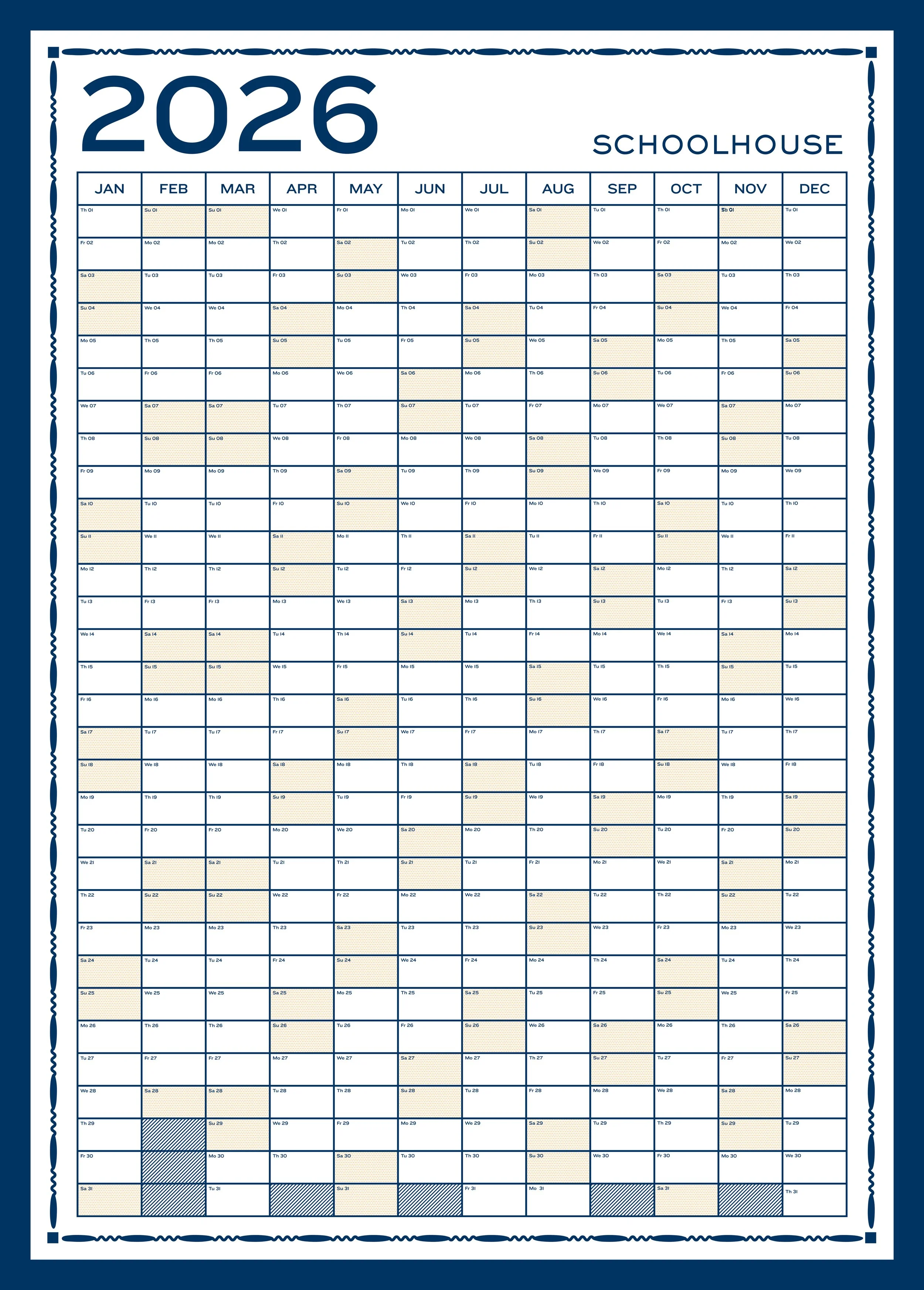
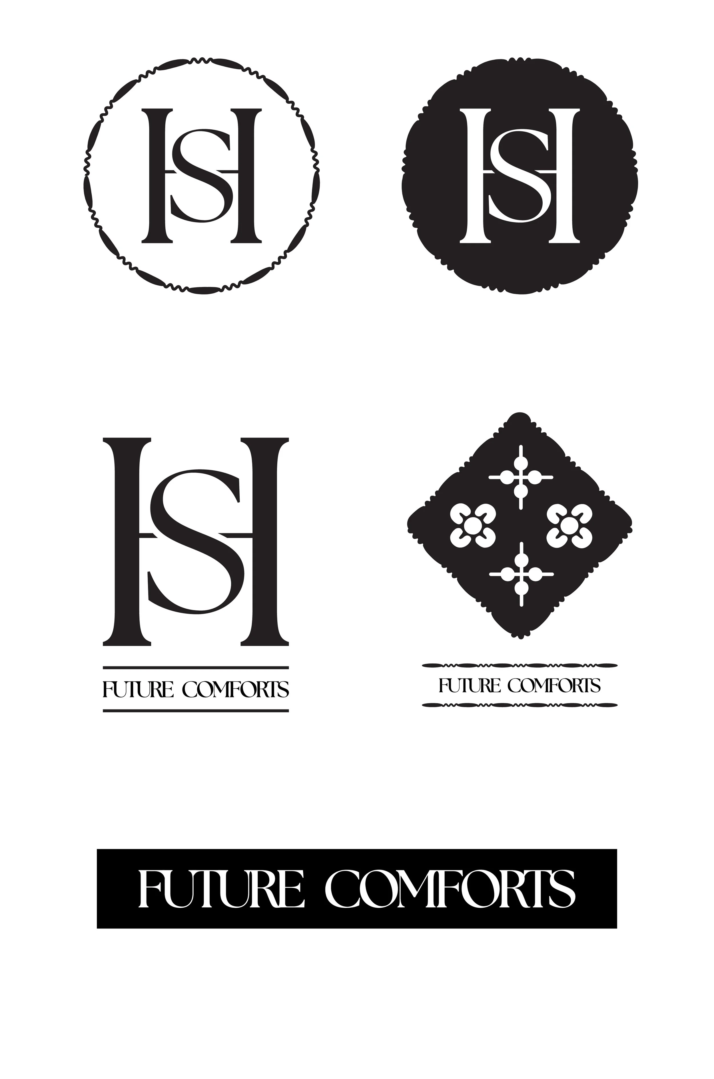
Beginning with logo exploration, I led the conceptual development of the campaign’s visual language by drawing from both best-selling and newly launched products. The floral and spoke illustrations were inspired by quilt patterns within the Schoolhouse product lineup, while the decorative border was adapted from the 2026 Big Picture Calendar that I designed. By leaning into a more traditional design language, I intentionally sought to evoke a sense of academic confidence and timeless credibility throughout the campaign.
This final logo was developed as a refined, striking icon for the campaign, drawing on traditional design cues intrinsic to the product line and subtly invoking the heritage of nostalgia. The wordmark is intentionally restrained, set in The Seasons to anchor the identity in the line’s traditional ethos while maintaining a clean, minimal expression. This approach ensures alignment with the broader Schoolhouse brand guidelines while allowing the campaign to feel both timeless and considered.
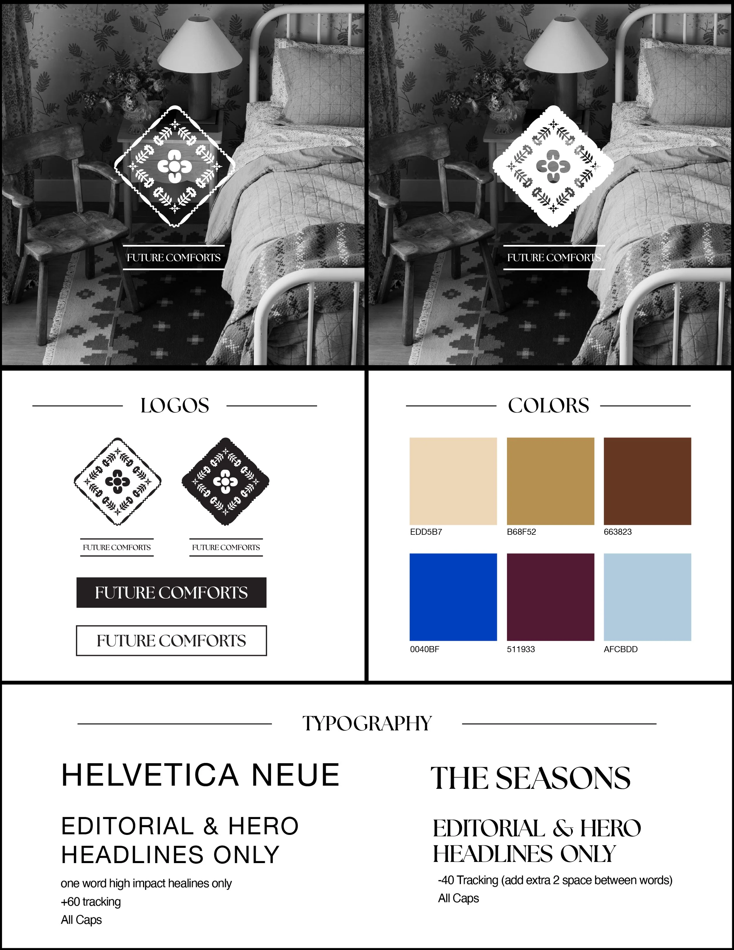
Building on the logo, I led the development of a comprehensive design system for the campaign, establishing clear guidelines and modular assets that enabled cross-functional teams to execute consistently and thoughtfully. This systemized approach supported cohesive storytelling at scale while allowing flexibility across channels and departmental needs.
The typography system was intentionally limited to headline applications, allowing the broader brand to continue using core fonts in other contexts. This ensured the campaign felt distinctive while remaining grounded in—and additive to—the existing brand identity.
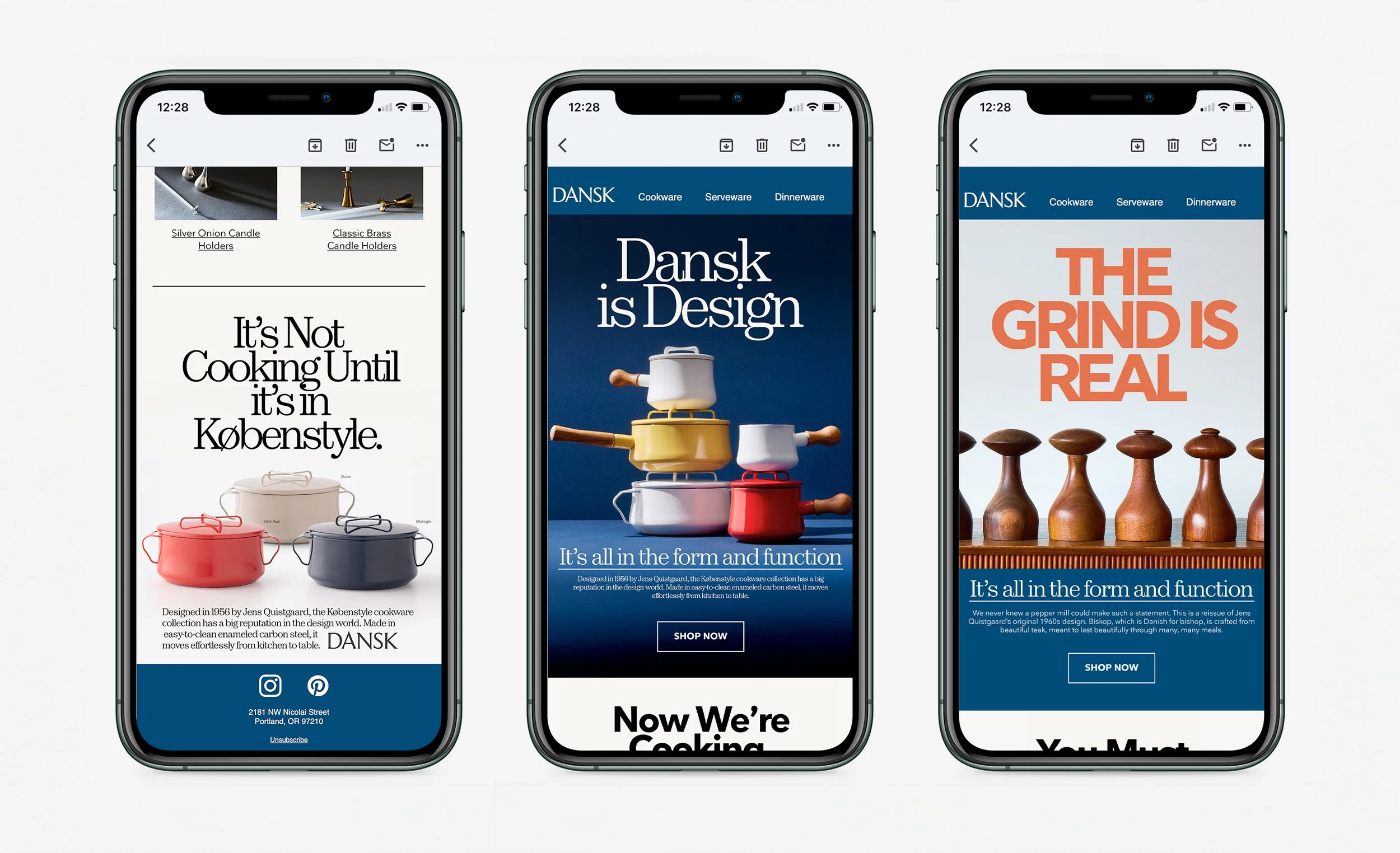
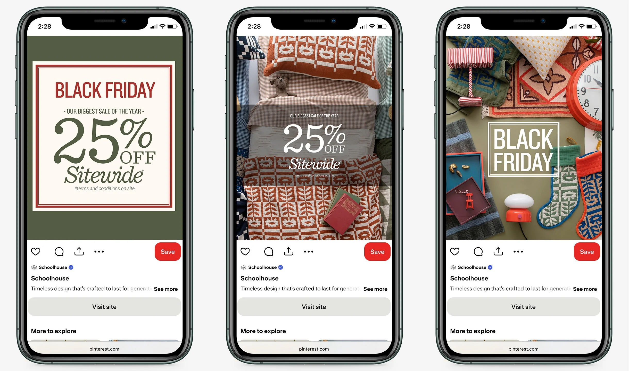
Shown here are examples of emails executed as part of the campaign, illustrating how the design system and visual identity were brought to life in situ across customer-facing communications.
An additional motion graphic used in the announcement of the campaign and a teaser for the product in the fall/winter season drop.