
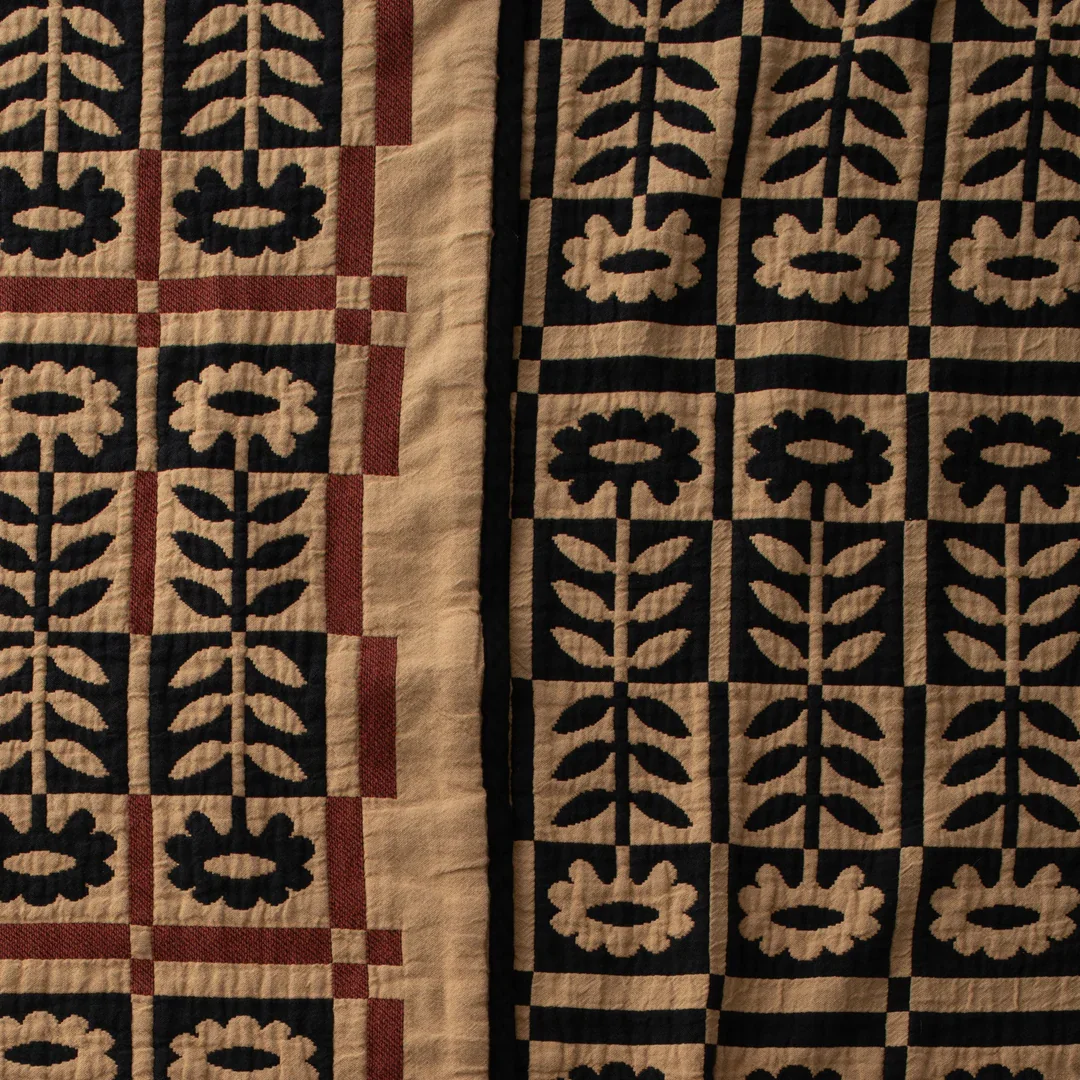
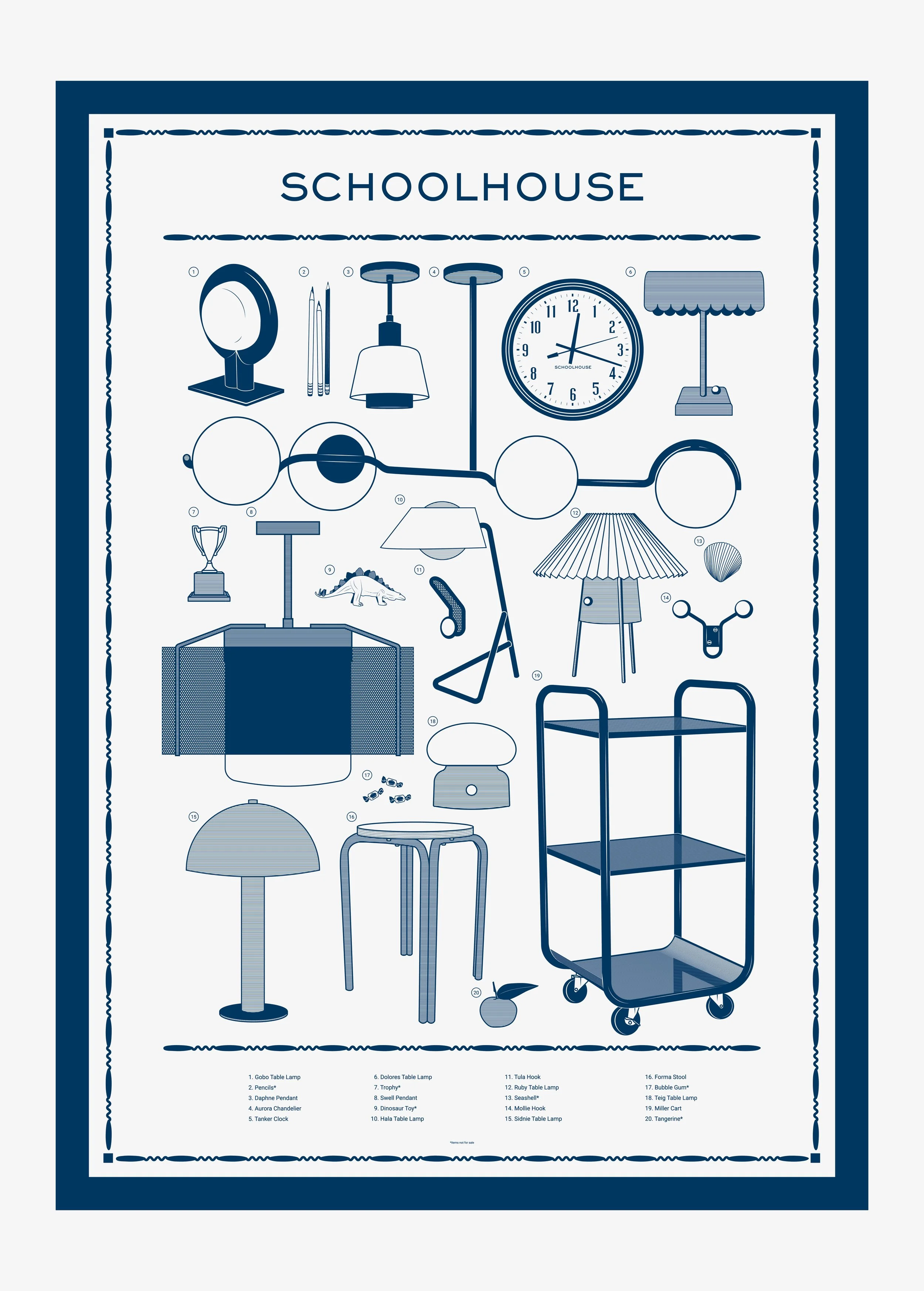
Beginning with logo exploration, I led the conceptual development of the campaign’s visual language by drawing from both best-selling and newly launched products. The floral and spoke illustrations were inspired by quilt patterns within the Schoolhouse product lineup, while the decorative border was adapted from the 2026 Big Picture Calendar that I designed. By leaning into a more traditional design language, I intentionally sought to evoke a sense of academic confidence and timeless credibility throughout the campaign.
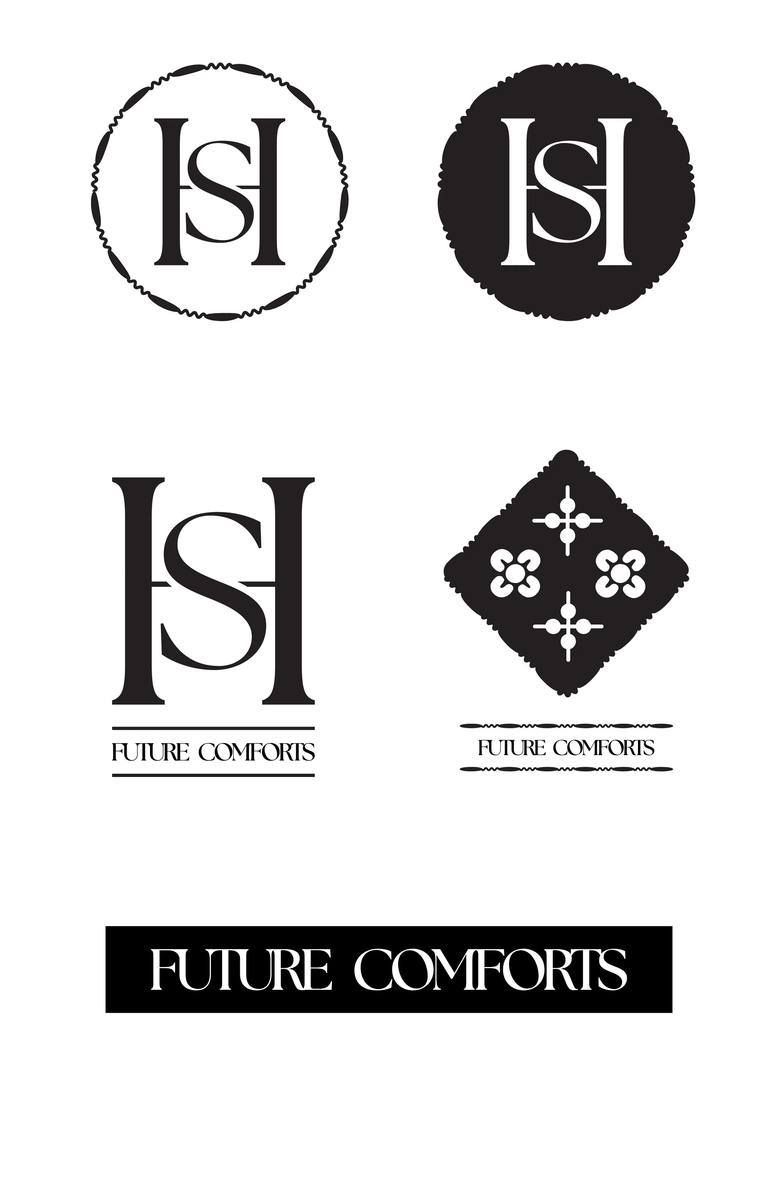
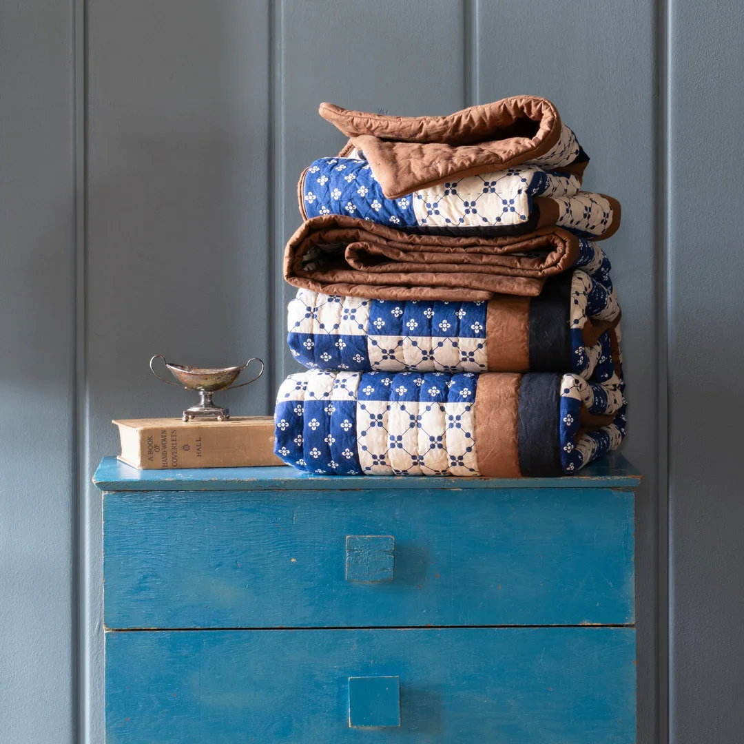
Preliminary logo and design concepts
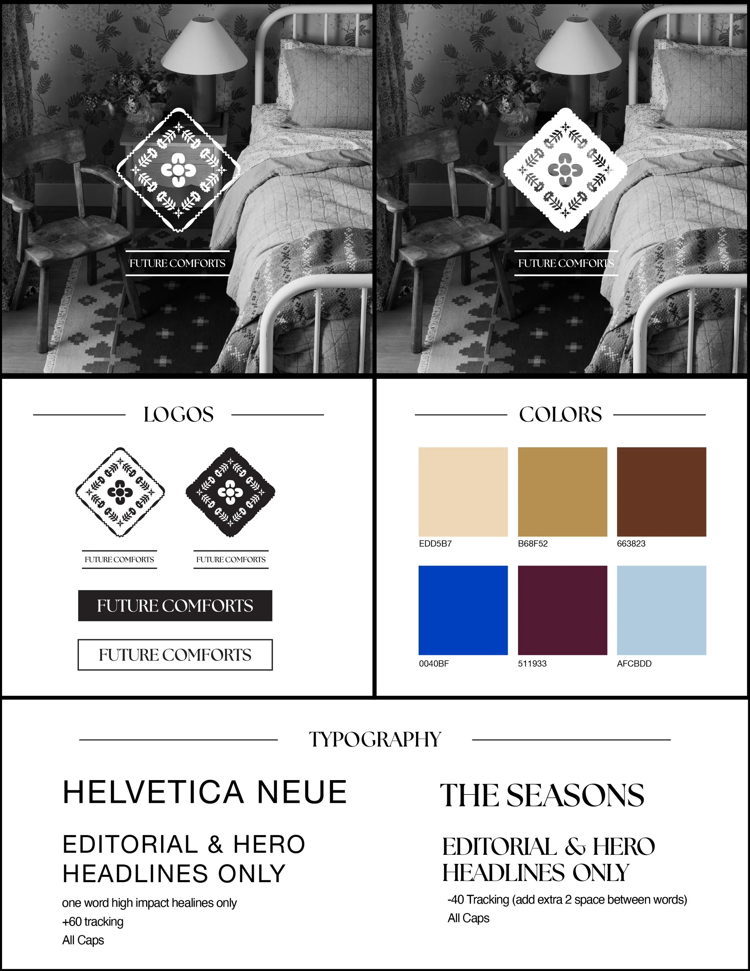
This final logo was developed as a refined, striking icon for the campaign, drawing on traditional design cues intrinsic to the product line and subtly invoking the feeling of heritage and nostalgia. The wordmark is intentionally restrained, using “The Seasons” font to anchor the identity while also maintaining a clean, minimal expression. This approach ensures alignment with the broader Schoolhouse brand guidelines while allowing the campaign to feel both timeless and considered.
Building on the logo, I led the development of a comprehensive design system for the campaign, establishing clear guidelines and modular assets that enabled cross-functional teams to execute consistently and thoughtfully. This systemized approach supported cohesive storytelling at scale while allowing flexibility across channels and departmental needs.
The typography system was intentionally limited to headline applications, allowing the broader brand to continue using core fonts in other contexts. This ensured the campaign felt distinctive while remaining grounded in—and additive to—the existing brand identity.
Shown here are examples of emails developed as part of the campaign, illustrating how the design system and visual identity came to life across customer-facing communications. Not only did I lead the design direction of these email templates, I executed the designs for production.
I also created a motion graphic announcing the campaign and teasing the Fall/Winter product launch.
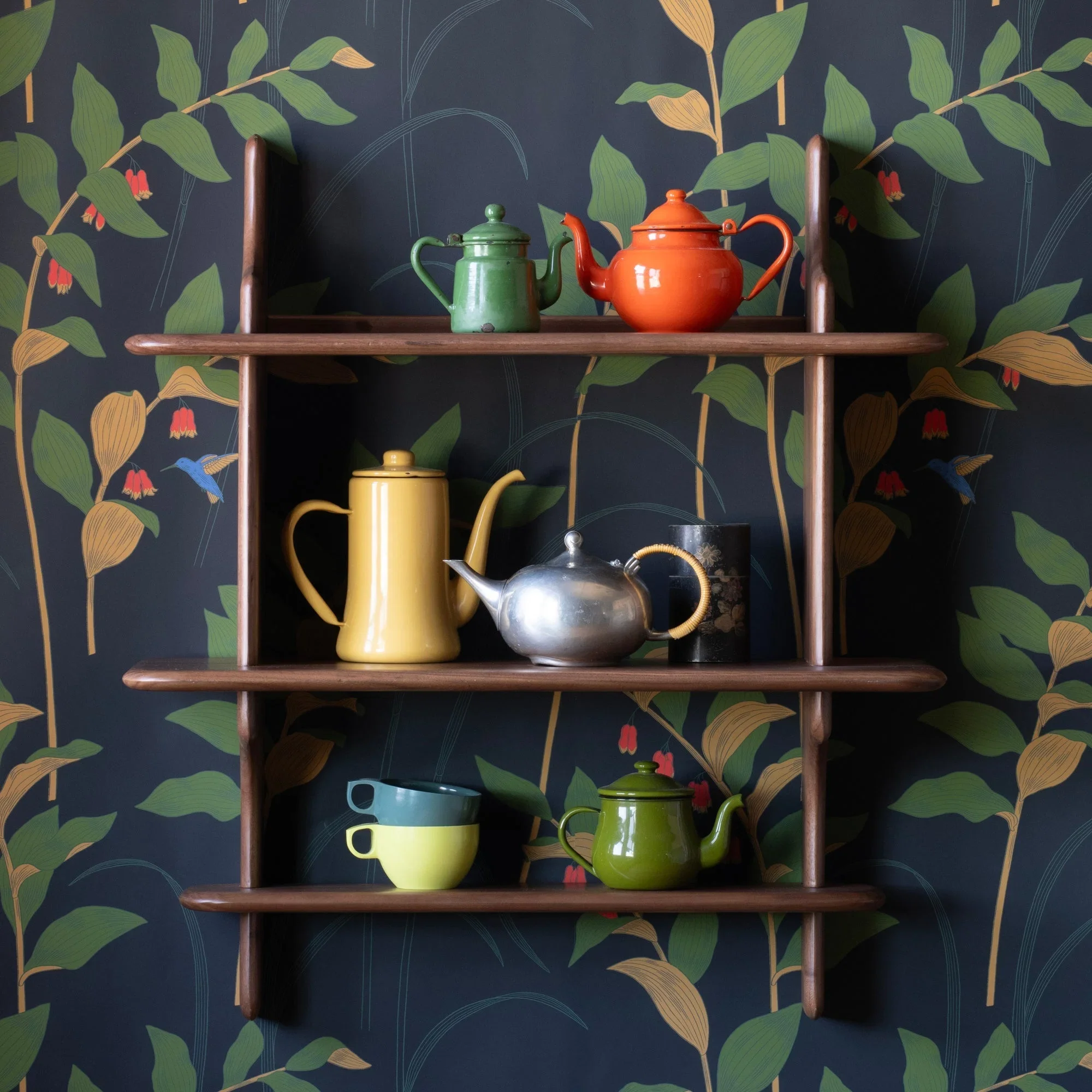
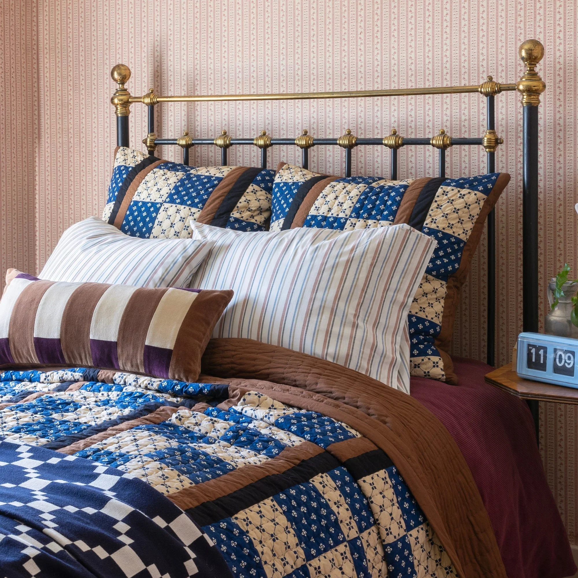
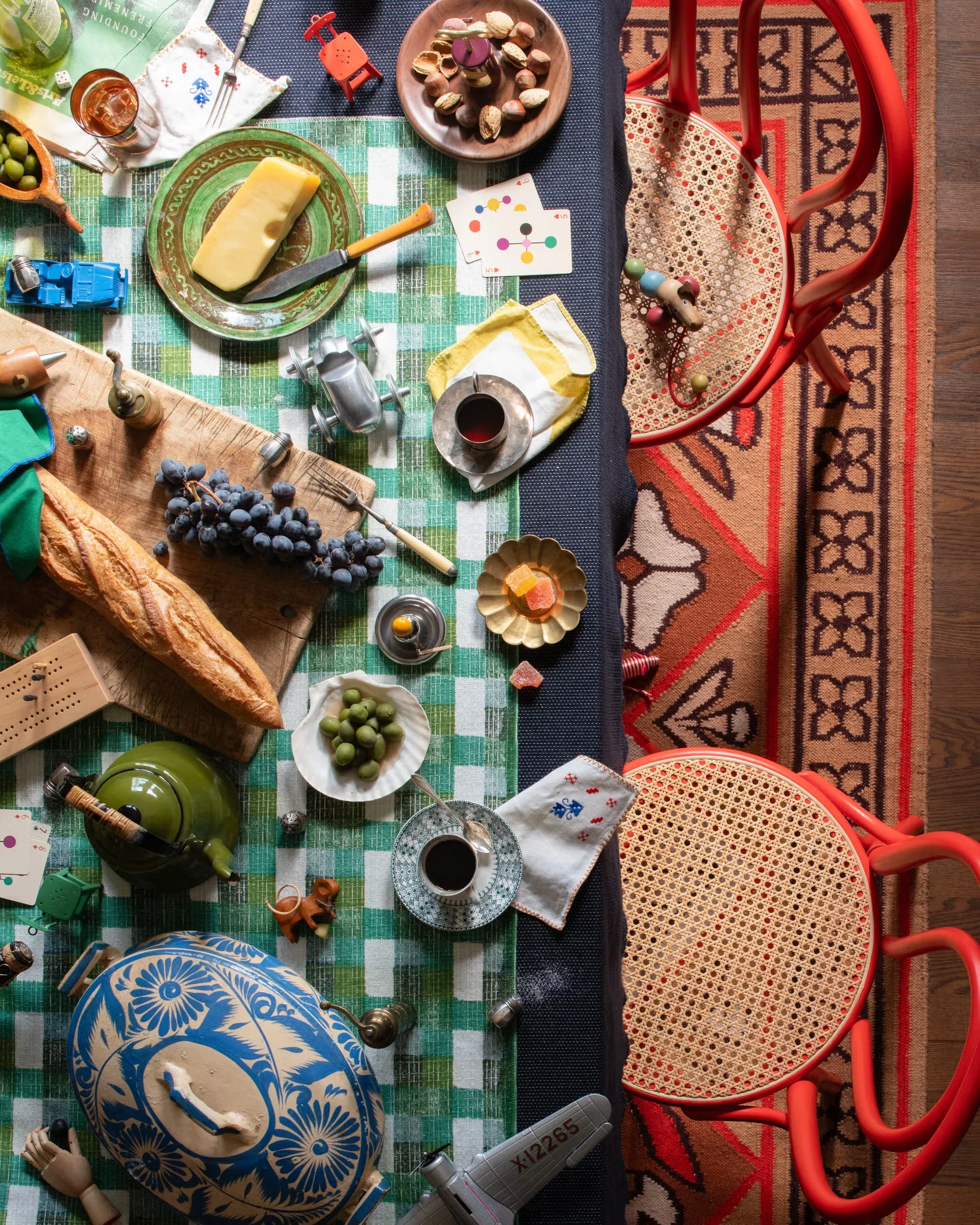
In the larger Future Comforts campaign, I wanted to introduce a sense of nostalgia and play through a series of “I Spy”-inspired images, with unexpected details and moments scattered throughout the broader campaign. From conception through execution, I helped lead the creative direction of these surprise-and-delight moments, bringing a more playful spirit to Schoolhouse while reinforcing the campaign’s larger themes of heritage and nostalgia. The series draws from the idea of the Modern Heirloom, using familiar objects, collected details, and a sense of discovery to ground the products in a world that feels both timeless, whimsical and distinctly personal.
Photos by Anna Whright
Copy by Chelsea Harris
Art Directing and Styling Jorie Garcia
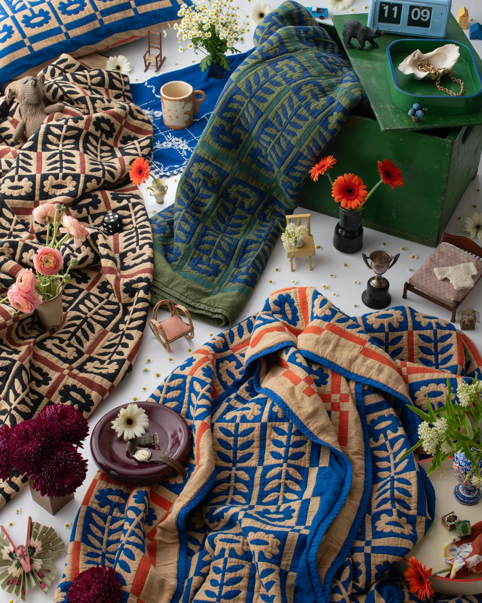
I spy a dog with a curious face,
A single die tucked in its place.
A mini Stillwater, a chair that rocks,
A blue toy truck and a birdhouse box.
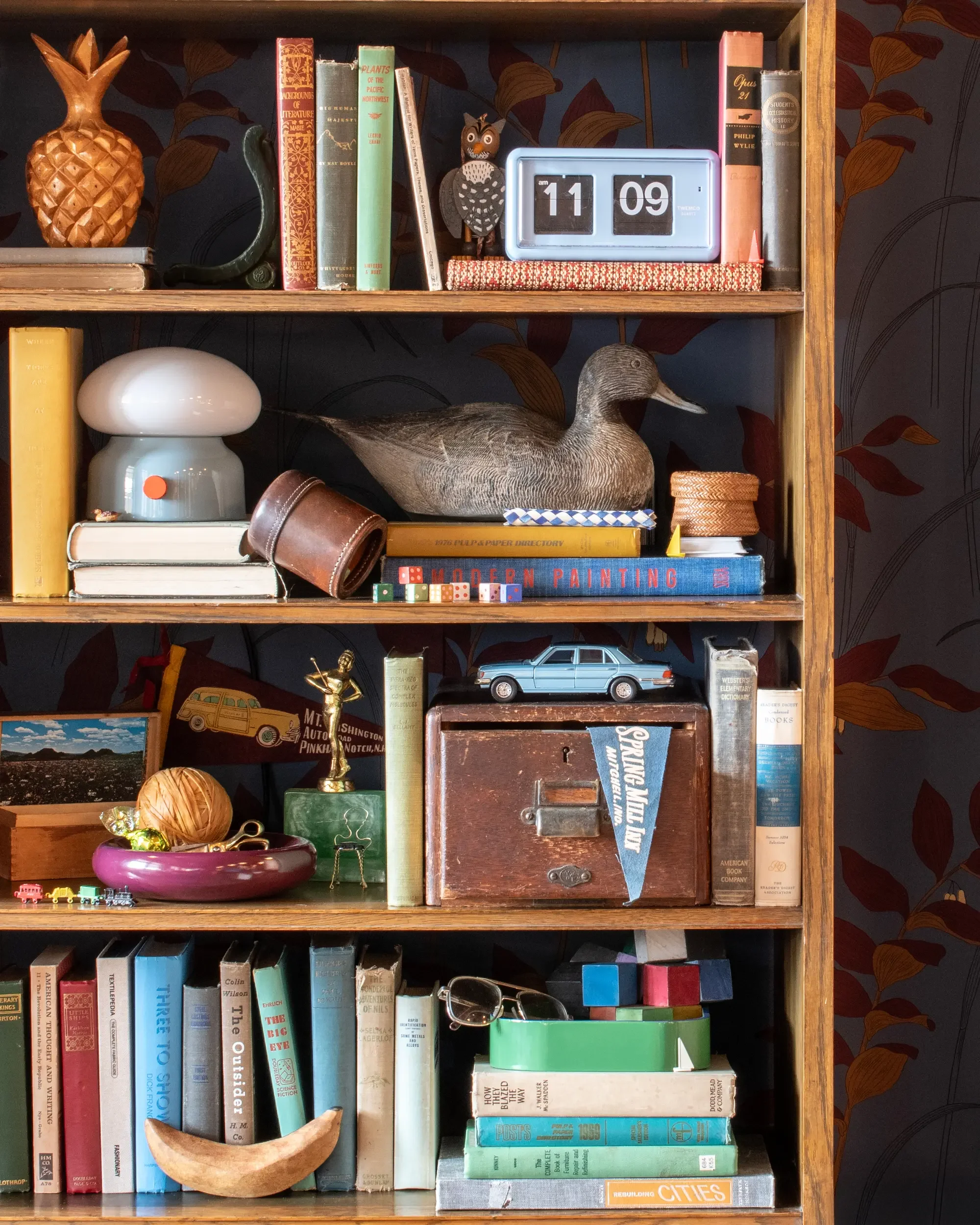
I spy three sailboats floating free,
A sweet chair waiting quietly.
Two ducks paddling close in view,
A finger trap to puzzle you,
And a sweet treat tucked in secretly.

I spy two mice, both clever and quick,
Six sneaky salt shakers hiding here and there for a pick.
Three little fives peek out from view,
A tiny dino waits, and a cube of cheese too!
I spy two skiers near the tree,
A pickle perched where ornaments be,
A bottle-brush forest set just right,
Two little sailboats in the light,
And a utility stool tucked in plain sight.